If you’re a filmmaker and you’d like to know more about editing, particularly colour, then you’ll love our free course, How to Colour Grade Video. In this DaVinci Resolve tutorial, you’ll see examples of how to use colour grading to create a continuity of feeling.
Storytelling With Colour Grading in DaVinci Resolve
Natural colour reinforces story, but sometimes you need a stronger touch. Stylised colour is a strong cue for your audience about the kind of story they’re watching. Strong colour grading can do a lot to create the tone of a story and to help the viewer suspend disbelief, but it’s very easy to go too far. In this lesson, you’ll see some examples of stylised colour grading plus a breakdown of exactly what goes into creating these.
The Steps to Stylised Colour Grading
Different colour correction software will mean a different approach and process, but the concepts are pretty much the same. This tutorial follows David Bode’s video lesson, with DaVinci Resolve.


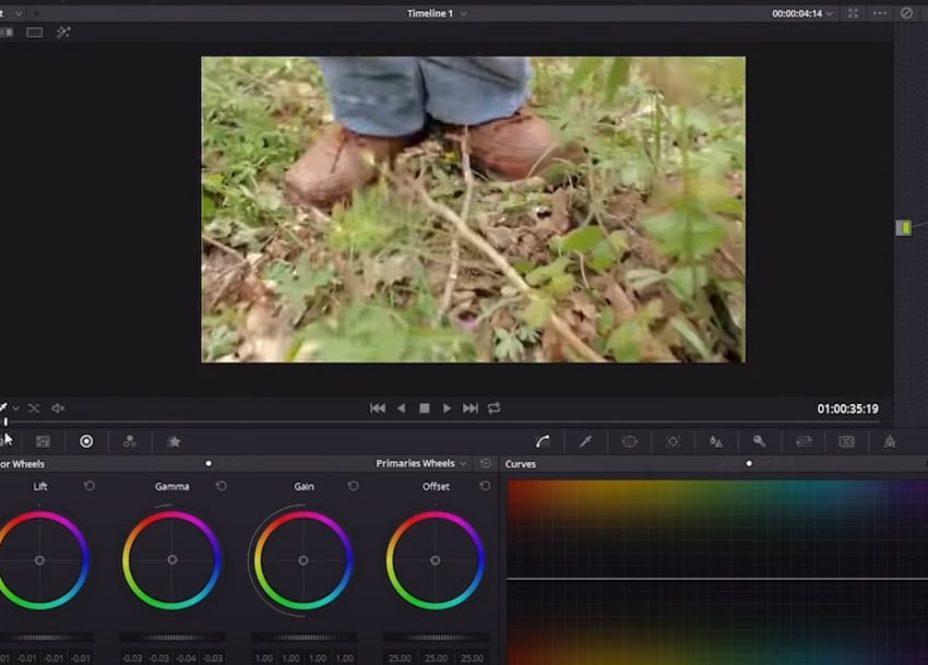
This is DaVinci Resolve with a clip of some legs and feet, which shuffle along. Let’s imagine you wanted this to be a zombie. The colouring would need a little work to match that idea because at the minute it’s well exposed and colour corrected, but it isn’t very stylised.
You might have inspiration in mind, like your favourite zombie movies or TV shows, and you could put together some reference images to shape exactly what you want. If your inspiration was The Walking Dead, for example, then you’d be looking to make this quite gritty and saturated.


Here’s the same clip after colouring, and you can see the nodes on the right—each of those has a stage of the grading. Here’s what went into it.
Colour Correction, Warming, Desaturation
The first node (01) is just the colour correction, the second (04) has a little warming, and the third (02) is desaturation, which is down by almost half of what it was. In the next one (03), all of the greenery was isolated with the Qualifier tool. Here’s what that looks like so you can see it better:


This means that only the greens will be affected, with everything else excluded, and then the hue was pushed up towards yellow, which is very subtle but makes a difference in the mix. It’s to give it a look that’s browner and a little dead, rather than those fresh spring greens which don’t really fit with the stylised look.
Contrast


In the next node (05), there’s a bit of a mid-tone bump to the contrast—clarity—with the mid-tone detail at the bottom which gives it a little more perceived sharpness, plus a few other adjustments like bumping the highlights.
Vignette


Finally, the last node (06) is a vignette to draw your eye to the middle of the frame.
This colour grade isn’t super stylised, but it is definitely stylised; the colours are being heavily desaturated and everything has a brown, warm tone to it that works quite well.
Another Example of Storytelling With Colour
Desaturation and Hue Adjustment


This clip has some soldiers walking, and in the first node (03) it’s a similar thing to what you saw in the ‘zombie’ clip, selecting the greens and pulling out most of the saturation while pushing it to more of a beige colour.
Temperature Change and Desaturation


The next node (04 – circled) is warming things up a little, and the one next to it (02) is a global desaturating. The greens have already been desaturated a bit, but this is working on the overall saturation.
Contrast and Clarity


Node 05 is giving everything a little bit of a mid-tone crunch, plus it’s also being warmed up a touch and the highlights bumped to give it some more punch.
Vignette


Finally, node 06 is another vignette to create a nice-looking ‘war’ look: desaturated, with lots of brown tones and so on.
Day to Night
For the last example, we’ll look at what goes into creating a night-time look on footage that was shot during the day. It can be a real challenge depending on what the footage is.


Here’s a beach scene shot with a drone during the day. In the first node (02), there’s a little desaturation, and in the next (03), there’s some reduction of contrast.
Making It Night…


The third node (04 – circled) is where you’ll see the most obvious correction. Using curves reduces most of the luminance out of the shot.


The last correction means you can’t really see as much, and there’s a character on the beach who would be entirely lost in this, so the next node (05) is giving a little bump of light just to him. It’s quite subtle, otherwise it would look as if he was spotlit, but it’s just enough to give him some attention.


In the last node (06) there’s a little creative problem-solving going on. During the day, foam on the water looks quite white, and pulling the luminance out of the shot has deadened all the tones and made it a bit flat, but in the moonlight it would probably be quite similar to bright sun.
In node 06, you can see a luma matte that’s targeting the brightest stuff, and then a mask to keep it limited to the water area without touching the beach. The effect of this is that it pushes up the whiteness of the water to make it look as if the moon is reflecting off it.


You can see the white there really lifts it compared to how it was before. How successful day-to-night is will really depend on the type of footage. It can be very tricky to make a sky look dark when it isn’t.
You can see there’s quite a lot that can be done with stylised colour grading, whether that’s a subtle adjustment of colours and tones to push the ‘feeling’ in a particular direction or something a lot more dramatic, like turning day to night.
More Film-Making Tutorials


How to Use a Gimbal with the BMPCC
How to Make a Simple Vertical Video Kit for Any Camera
How to Install LUTs to the BMPCC
How to Collaborate on Video Projects in Final Cut Pro X


About the Authors
David Bode created the video course that includes this lesson. Dave is an expert on video and audio production, and he lives in the upstate NY area. He works as a camera operator, editor, inventor, motion graphics designer, recording engineer, and studio musician.
Marie Gardiner wrote the text version of this lesson, and it was edited and published by Jackson Couse. Jackson is a photographer and the editor of the Photo & Video section of Envato Tuts+.

