If you follow any travel photographers or videographers on social media, or watch television, it won’t take much scrolling until you see the orange and teal look in action. You’ll see it in travel photography, particularly for perfectly balanced oceanside photos.
In this tutorial, you’ll learn how to create the orange and teal look in Adobe Lightroom and apply it to your photos.
The Orange and Teal Look
I’ll bet you’ve seen the orange and teal look in action many times, but have you stopped to consider how it works? Orange and blue are “complementary” colors: it feels natural and visually appealing to pair these colors together, so it’s no wonder that this tint combo is popular.
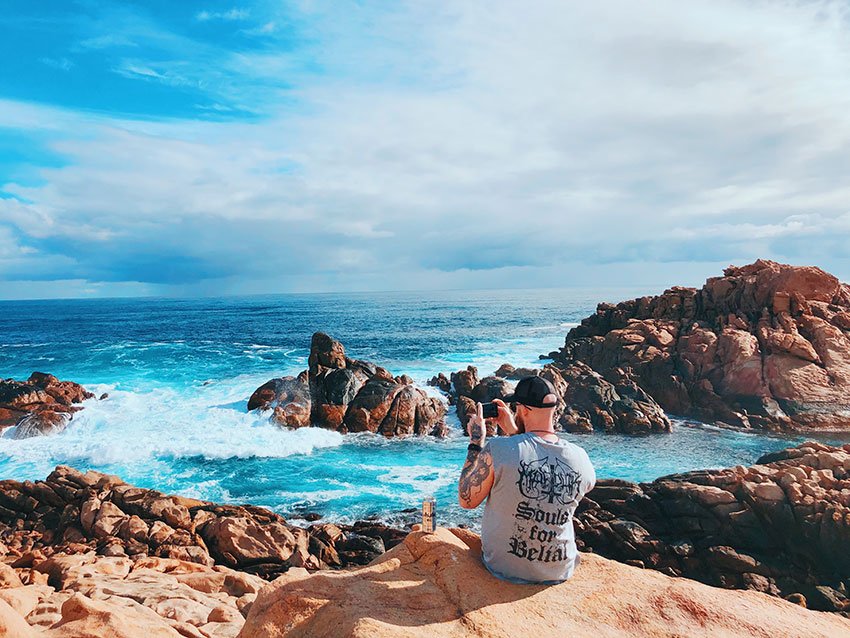
Let’s start by studying a sample image. In the photo below, notice that:
- The water, particularly in the foreground, is more teal than blue.
- Notice in the sky, there’s an almost warming tint to the clouds that breaks from the blue sky surrounding it.
- In the shadow areas in the rocks, the tone curve is flattened and they’re slightly tinted blue.


With our sample image in mind, here are three Lightroom adjustments that create the orange and teal look:
- Highlights, typically tinted with with orange
- Shadows, adding blue (which later shifts to teal) to the shadows creates the perfect complement to warm skin tones
- Blue hue shift to teal, shifted from a neutral blue with an additional green tinting, ultimately replaces blue with teal
Lightroom makes it easy to apply all of these adjustments. Read on to learn how to apply it to your favorite images.


How to Create the Orange and Teal Look in Photos With Lightroom Classic
Now that we’ve defined the orange and teal look, let’s create it in Adobe Lightroom.
1. Shift Blue to Teal
Let’s start off by shifting our hues. Because we’ve only corrected the image so far, the blues are still neutral and true to their real life rendering.


On the H/S/L panel, I’m going to start by adjusting two sliders. Find the Aqua and Blue sliders, and start to pull on them. The goal here is to shift blue toward the more teal range; moving Blue to the left and Aqua to the right creates the effect we’re looking for.


2. Add Orange to Highlights
Now, let’s change gears and find the Color Grading panel. If you’ve worked with video editing software, you’ll feel right at home with these controls.
Find the wheel labelled Highlights. The color wheel controls how we adjust the color for the specific wheel. In this case, that means adding hue to the Highlights regions of your image.
Start off by dragging the circle toward the orange part of the circle. In my example, this transforms the sky with more orange tints given that these are the lighter areas of the image.


3. Add Blue to Shadows
Remember, part of the the orange and teal look relies on blue hues in the shadow tonal ranges. This creates a complementary balance to the orange we just added.
Find the Shadows wheel. Take the center point and drag it toward the blue part of the circle in the lower left.


4. Add Vibrance
To really finish up your orange-and-teal look, it helps to turn up the Vibrance slider. In the example below, I’ve increased this to really emphasize the teal tones in the water. The sky has just enough orange to counter balance my image and embody the orange and teal look.
Most of the fun in this process is experimentation. There’s no perfect way to apply adjustments. Try more or less orange, tinting your blues more heavily, and more.


How To Save The Orange And Teal Look As A Preset
You spent time creating your orange and teal look. Now, let’s save it so that it’s reusable in the future.
In the Develop module, find the Presets panel on the left side of the app, and click on the + button, and choose Create Preset.
Now, you’ll see a somewhat intimidating menu with endless check boxes. The purpose of this screen is to choose what adjustments you want to include as part of your Lightroom preset. In our example, I’d recommend checking Color and Color Grading. Give your preset a name, and click Create to save it.


Now, your preset is reusable. Just click on the name on the Presets panel to apply it to the active image.
Try creating many versions of the same basic orange and teal look. Experiment with the amount of adjustments in each of the three factors, and save presets for each one.
More Orange and Teal Presets
This tutorial showed you how to create your orange and teal look. If you want to borrow from others, and gain inspiration in the process, the best option is to use Lightroom presets. These already have the look built for you, and you can apply them with just one click. Best of all, you can watch the sliders and adjustments move so that you can learn in the process.
Get the best Lightroom presets on Envato Elements. For one flat rate, you can unlock every preset in the huge asset library. They’re all tested and quality-controlled to ensure that your images will look fantastic. Here are a few of our favorite orange and teal presets from Envato Elements. They’re all included!
Orange & Teal Lightroom Presets Vol. 2
Whether you use Lightroom Classic or Lightroom CC, this preset package has you covered. You’ve got 15 files you can use to test out the orange and teal look.
Orange Teal Lightroom Presets and LUTs
Who knew that there were 26 different ways to package an orange and teal look? Well, this preset pack proves it. Each preset is different but achieves a common look. Try them all out for variety.
Orange and Teal Lightroom Presets Desktop & Mobile
Our last selection of orange and teal presets definitely tilts toward orange-heavy looks. Perfect for sunwashed images at the beach, try out these eight presets.


More Top Adobe Lightroom Resources


