If you’re a photographer and you’d like to know more about lenses, then you’ll love the photo tips in our free course, What Every Photographer Should Know About Lenses. In this lens selection tutorial, you’ll learn about blurring, loss of contrast, chromatic aberration, vignetting and distortion by taking a look at some ‘bad’ lenses.
If you look around at photo lenses, you will see a vast difference in the prices. Generally, more expensive lenses are better, but why? The easiest way to explain this is to see what a ‘bad’ lens looks like. After all, a good lens is one that doesn’t exhibit the characteristics of a bad lens. Lenses are only good compared to other lenses.
What Makes a ‘Bad’ Photography Lens?
Blurring
In photography, we want to capture as much detail as we can. If we want to selectively blur our image in post-production, we can, but, it makes sense to start with something sharp.
Blurring in lenses is not the part of the image that is out of focus—it’s either motion blur or a lack of sharpness from the lens.


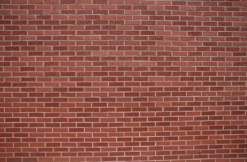
In this example, we’re looking at two photos that were taken at about 18mm, of a brick wall. A brick wall is flat and has a lot of detail, and when you look at a photo like this you see the whole thing, which doesn’t look too bad. If you’re a pixel peeper, though, which means you like to look at things at a 1:1 pixel ratio, then you’ll see something different. The image above was taken with a Sigma 17-50mm f/2.8.


Zoomed in at 100%, the centre of the wall is sharp, but the corner, which is what you can see above, is very soft. There’s a noticeable drop-off in sharpness.
Let’s compare this image with a similar one taken with a different lens:


Both of these images exhibit blurring, but the one above looks much worse. It was taken with a Canon EFS 18-55mm f/3.5-5.6, which is a cheap ‘kit’ lens—one that comes with the camera when you buy it. It’s not a very sharp lens.


This is the centre of both images side by side. They’re not exactly the same, but there’s a clear difference in the centre sharpness, which is where you’d expect it to be most crisp. It’s just not as sharp as a better lens, a more high-quality piece of glass—in this case the Sigma—even in the centre.


You can really see the difference if you look at the details in the shadows here. Just look at how sharp these shadows are rendered in the centre in the left image (the Sigma) compared to the Canon on the right.
They were taken probably less than 15 seconds apart, so there’s no shift in the lighting. In fact, on this day there were no clouds in the sky, so it’s the same lighting.
The Sigma is f/2.8, so it’s a constant aperture lens, and it’s showing sharpness at a more wide-open aperture. Usually, unless you’re talking about the very best lenses, you’ll see a little blurring in the corners, especially with zoom lenses, but as you saw with the centre of both of these images, if this was your only reference point… the cheaper lens is not great. And that’s what you get with a ‘better’ lens—it will do a better job with sharpness and not exhibit as much blurring, particularly in the corners but generally all over.
Contrast
One of the things that makes a lens great is nice-looking contrast. Contrast is detail, and lenses that have poor contrast performance, just like with blurring, lack detail.
In this example, we’ll look at the difference between two different lenses again, this time on a picture of a desk that’s been lit with a studio strobe at about 50mm at around f/5.6. Both of the images were taken with the same flash setting, so the lighting is very consistent.


Look at the difference in contrast between the two images. The second one to the right is obviously sharper, but what we’re looking at is the difference between the contrast of these two images, which is pretty subtle.
The one on the left isn’t terrible, but the one on the right looks punchier, the colours look a little bit deeper, and it looks as if it has more contrast, whereas the other one is flatter.
Chromatic Aberration
Chromatic aberration is a type of distortion in which the lens fails to focus all colours to the same convergence point. Put simply, chromatic aberration is a smearing of the colours you can see on the edges of objects.
In this example, we’re going to look at another pair of images taken with different lenses. If we’re looking at an image as a whole, chromatic aberration is a huge deal. It can be corrected to some degree in editing suites like Photoshop and Lightroom, but it’s much better to start with an image that has less of it because it can affect the image quite drastically.


This was taken with a Canon 70-200mm f/2.8 IS that cost over $2,000. You’ll spot chromatic aberration particularly between high contrast points. In the image above, you can see the red between the white part and the dark part, like a red haze where the two meet. It’s not too bad, but you can see it.


Let’s compare that with this image taken with a different lens, a Quantaray 70-300mm f/4.5-6.3 that cost about $160. If you look at the leafy area, you can see a different kind of chromatic aberration, more commonly referred to as purple fringing. The lens isn’t focusing the violet wavelengths properly, which is why we’re getting this purple fringing.


You can see purple fringing here along the same points as with the Canon lens, but this one is much, much worse. Every single high-contrast point has this, and it’s soft—it’s not good. The image could be cleaned up a bit in a photo-processing application, but it’s still going to look bad.
There’s a huge difference between a cheaper lens like the Quantaray and a professional lens like the Canon. Higher-end lenses use low dispersion (LD) glass that contains fluorite. These hybridised glasses have very low levels of optical dispersion, resulting in less chromatic aberration.
Vignetting
In photography and optics, vignetting is a reduction of the image’s brightness or saturation at the periphery, compared to the image centre. Many lenses have vignetting when set to their maximum aperture, but lower quality optics will have more. Vignetting also usually gets better as you stop the lens down.
For this example, we’ll look at a plain wall to see how vignetting on these lenses is affecting our image. When you’re shooting in the real world, vignetting is often much more difficult to see because you don’t know if you’re seeing vignetting or the natural fall-off of light in that particular area. If you shoot something that’s a solid colour, lit in a flat way, then you can see what the lens is actually doing.


Here you can see a definite darkening in the corners and along the edges of the image. You’ll see more vignetting on the sides than the top because this image is wider than it is tall, which means as we get closer to the edges of the projected image circle, we see more vignetting.


Crop sensor cameras do better with vignetting than a full frame or larger sensor camera, especially if you’re using non-crop lenses or non-digital lenses, because these project an image circle appropriate to fill a full-frame camera. The example photos were taken on an APS-C sized camera, which means that the full image circle is larger than the image, so we don’t see as much vignetting as on a full-frame camera.
If we put either the cheaper lens or the more expensive one on a full-frame camera, there’d be more vignetting of both lenses, but the cheaper one would look worse and more prevalent when using a larger sensor.
Distortion
Distortion is another effect that can be present on many lenses. There are two major types of distortion: barrel and pincushion.
Barrel
In barrel distortion, image magnification decreases with distance from the optical axis or centre. The apparent effect is that of an image which has been mapped around a sphere or barrel.
In a zoom lens, barrel distortion appears in the middle of the lens’s focal length range, and it’s the worst at the wide end of the range.


We’re back to the brick wall from earlier, but this time we’re focusing on what’s happening to the distortion of this image. This was taken with the Canon EFS 18-55mm, and you can see this bulge in the centre of the image where it looks as if it’s being mapped around a barrel; hence the name.


This is the same image taken with the Sigma 17-50mm lens, and you can see that the barrel distortion is much more pronounced on the cheaper Canon lens in the previous photo than this one. That may be partially because the Canon lens is a bit more of a variable focal length lens, 18-55mm, whereas this is 17mm-50mm so it’s a little bit more telephoto. As lenses have more of a telephoto range, i.e. more zoom range, you can expect more distortion at the long and short end of the focal length.
Pincushion


In pincushion distortion, image magnification increases with distance from the optical axis, or centre. The visible effect is that lines that don’t go through the centre of the image are bowed inward, toward the centre of the image, like a pincushion.
Pincushion distortion usually occurs at the longer end of the focal range. It’s difficult to show an example in still images because it can be very subtle, and you really only notice the difference when you flip between the images.
With pincushioning, the centre of your image will look squished, in the opposite direction than it did with barrelling.
Pincushioning will happen to some degree with most lenses, but again it’s going to be the cheaper glass where that’s more pronounced and obvious.
Conclusion
Now that you have a better understanding of what makes a ‘bad’ lens, you’ll be better informed when you make your lens selection. That’s not to say expensive is always better, but when you know the trade-offs—things like chromatic aberration, vignetting, and distortion—you can make informed decisions about the deal-breakers and the things that don’t matter quite so much.
More Photo Tips and Lens Tutorials


How to Use Macro Lenses to Photograph Things in Close-Up Detail
How to Use Medium Telephoto Lenses for Photography
Zoom vs. Prime Lenses for Night Photography: What’s Best?
Primes vs Zooms: Pros and Cons of Fixed Focal Length Lenses for Photography


About the Video Author
David Bode created the video course that includes this lesson. Dave is an expert on video and audio production, and he lives in the upstate NY area. He works as a camera operator, editor, inventor, motion graphics designer, recording engineer, and studio musician.
Marie Gardiner wrote the text version of this lesson and it was edited and published by Jackson Couse. Jackson is a photographer and the editor of the Photo & Video section of Envato Tuts+.

