Photographing in RAW format gives you the best options for your post-processing as it’s retaining all the information from when you took the image. Due to that, though, RAW files have a large file size and look a little flat, so they might require a little more ‘post-shoot’ thought than some other formats.
Here, we’ll take a look at how you can build a good, solid post-processing workflow in Adobe Camera RAW, linking you to more in-depth articles on some of the things we cover, so you can learn more at your own pace.
How to Build a Basic Photo Post-Processing Workflow With Adobe Camera Raw (Quick Start Guide)
Organising Files


Once you’ve got your RAW files, you might wonder what to do with them. Before post-processing can begin, it’s wise to organise your photographs. Sometimes it’s tempting to just pop everything into a folder and be done with it, but it makes life difficult later on if you’re looking for something specific.
Adobe Bridge is a great way to sort your photos, and it’s free to download and use with an Adobe account.
Bridge is really instinctive to use and navigates the hierarchical file systems on Windows and Mac, displaying folders logically rather than forcing you to import a catalogue. Once you’re set up in Bridge, you can organise, move, name, and add keywords and metadata to images.
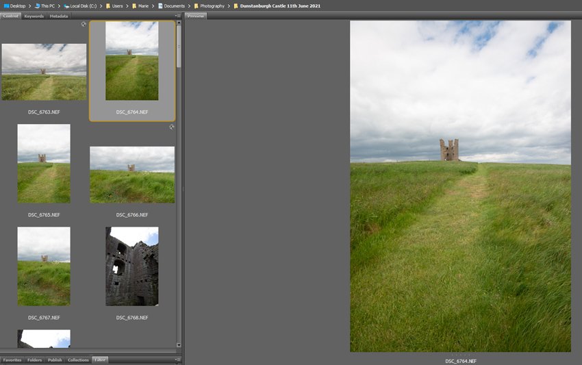
Review and Sort Files
You can also review and sort your photos ready for post-processing, making passes over your thumbnails and rating them from 1 to 5 based on your goals. You might, for example, disregard any that have missed focus by rating them as 1 (or rejecting them) and rate any that you definitely want to move forward to processing as a 5. This will help you put together sets too, if you need to do that for publication or exhibition.
Post-Processing Workflow: Corrections
The first thing to do before you get down to the nitty-gritty of post-processing is to fix anything that’s ‘wrong’ with the photograph.
Add Profile Corrections


Applying profile corrections in Optics helps to adjust certain defects that occur at particular focal lengths, distances, and f-stops across different lenses. Applying these will correct any vignettes (darkened corners), distortion (bowing and bending), or chromatic aberration (usually unusual or coloured fringes seen in highlights).
You can also adjust these manually if you need to.
Straighten


If your horizon line is a bit wonky, or your image is otherwise slightly off, there are a number of tools in ACR under the Geometry tab to help sort it out. You can have ACR straighten it automatically for you—based on a number of options—or you can manually adjust things like the scale and aspect until your picture looks right.
Post Processing Workflow: Basic Edits
Exposure, Highlights, and Shadows


Looking at the image and at your histogram, you’ll be able to see what changes need to be made. In the image above, you can see the sky is quite bright, and the shadows are very dark. Both of these things are easily seen in the histogram too, with the high peaks to the left (shadows) and right (highlights).


Adjusting the Highlights and Shadows sliders can help bring some of that detail back. Usually you won’t need to pull them all the way—it’s nice to keep some brightness in the highlights and some depth in the shadows.
White Balance & Tints
If you had your camera on auto white balance, it’s probably done a good enough job, but if your image is too cold (blue) or too warm (yellow) then there are automatic settings you can try to adjust those.


Auto won’t always give you a great result. You can see in my image above that when I select Auto, it actually makes the image too warm. For that reason, it’s better to manually adjust the Temperature slider yourself until you get a good compromise.
Contrast, Texture, and Clarity
If your image is a little flat—you’ll see from your histogram that a lot of the information will be grouped in the middle—then you might want to add a little contrast with the Contrast slider. Likewise, if there’s too much contrast, you might want to reduce it.


There are other ways to adjust the contrast in your photographs too. The tone curve is a particularly effective one and gives you greater control over contrast in specific areas of your photograph, targeting tonal ranges rather than making one change across the whole range.
Texture and Clarity


Clarity will target midtones to add contrast, while leaving the shadows and highlights untouched. Texture sharpens in one direction and smooths in the other. Unlike Sharpen, though, Texture doesn’t target the edges of shapes, but instead enhances textures that are already present.
The two tools combined are great for things like buildings and other photographs that already have great textures that you’d like to bring out more.
In the example above, you can see how it works on mossy stones. Although the image is noisy as it’s zoomed into 100%, you can see the texture of the stones is greater after Clarity and Texture are applied.
Vibrance and Saturation


A little like with Clarity and Texture, Vibrance and Saturation have different goals. Saturation targets your whole image, while Vibrance focuses on the midtones. If your photo is lacking in colour, then they’re a great place to start. Colour grading will give you more targeted options, though, and we’ll follow up on that later in the article.
Sharpness and Noise Reduction


The sharpening options in ACR are not bad at all. They let you control how the edges of objects are changed, but then also adjust the radius to decide if neighbouring pixels are also affected.
Noise Reduction is similar, but obviously with the opposite effect! You can control the balance of noise reduction, detail preservation, and contrast. It’s worth learning more about these tools so you can make better adjustments for your photographs, but the real key when experimenting is to zoom in to 100% to see how changes affect your image, before zooming back out and looking at it as a whole.
It’s best to do some subtle sharpening when it comes to your RAW image, and then you can do further targeted, raster sharpening as you resize images for different outputs in your photo suite.
Selective/Targeted Adjustments


When you’ve finished your basic edits, you can move on to more targeted adjustments. What exactly they’ll be will depend on your image, but it could be things like more enhanced portrait editing, removing dust and dirt spots from a landscape, or just a more focused version of edits you’ve done in Basic, like targeting areas to sharpen, lighten, etc. You can paint a mask onto the parts of your image that you want to edit, as above.
Presets & LUTs


LUTs and presets are pre-designed ‘effects’ for your photos, designed to give them a particular look or colouring. The difference between them is that LUTs work via Look up Tables, and the key with these is that they don’t touch your editing sliders, so you can use them at any point in your editing workflow.
Personally, if I’m going to use a LUT, I’ll do that after I’ve made my basic adjustments and then make further changes once I’ve got the effect I want from the LUT.


If you use a preset, you’ll have to adjust your workflow. Unlike a LUT, they move your editing sliders to create their effects, so you would need to apply your preset first and then make extra tweaks. Sometimes, when you download LUTs or presets, you’ll get both options to install, so just be sure you know which you’re picking. If you can, LUTs are always the better option because you’ll have more flexibility with the editing.
Colour Grading


Colour grading is probably not something you’d use in conjunction with a LUT or preset, but if you’ve used a LUT to correct colour rather than alter the look, then you might also want to colour grade your image.
It’s a fairly new tool for Adobe Camera Raw, and it’s given a lot more flexibility to how you can colour an image, rather than just using the Colour Mixer options. Colour grading is a great way to adjust the colour in your image, whether that’s correctively (to fix a tint) or something a little more stylised, like in the image above.
More Adobe Camera Raw Tutorials


How to Make HDR Exterior Architecture Photos With Adobe Camera Raw
How to Merge and Edit High Dynamic Range Photos in Adobe Camera Raw
10 Top Presets and LUTs for Adobe Camera Raw to Add Picture Styles Instantly
How to Create a Panoramic Photo in Adobe Camera Raw (Great for Landscapes)


About This Page
About the Authors
Marie Gardiner is a writer and photographer from the North East of England. After gaining her degree in Film and Media, Marie worked in the media industry, before leaving to set up the business she runs with her partner: Lonely Tower Film & Media. As well as writing about visual practices like photography and video, Marie is also the author of Sunderland Industrial Giant (The History Press, 2017) and Secret Sunderland (Amberley Publishing 2019). Her photographic work focuses on landscapes and industrial ruins, particularly those of the North Pennines as she continues to work on her long-form documentary project Changing Landscapes.

